Display.grid
Displays the given components with the specified, grid-based layout.
Display.grid(columns, props)Creating layouts with Grid component
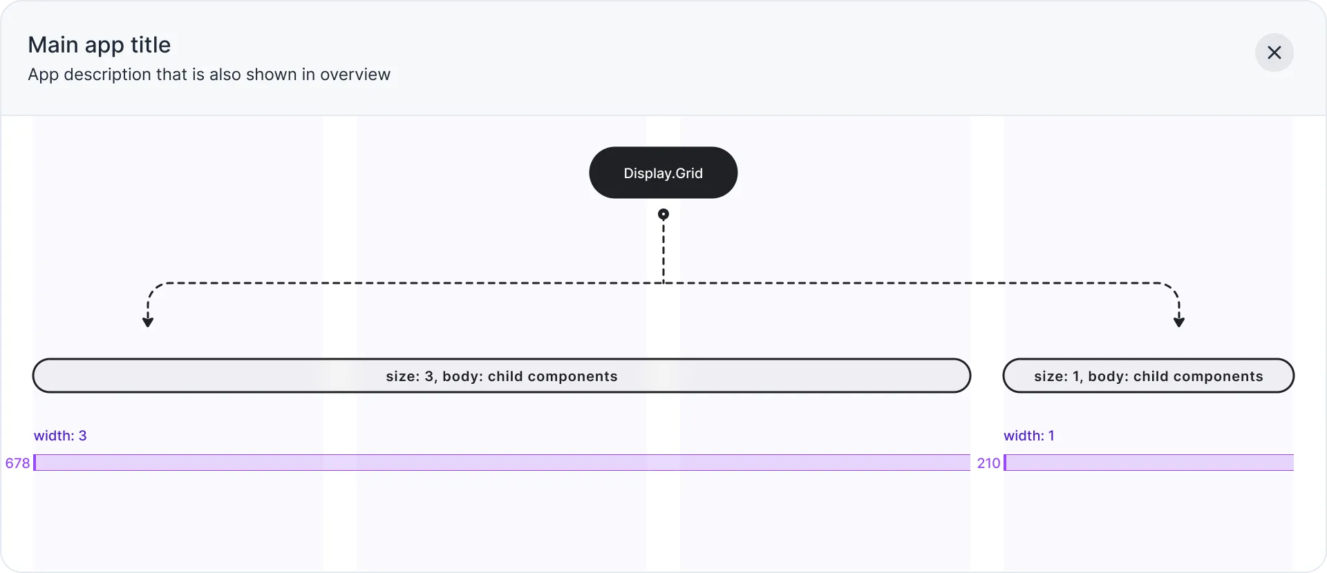
Display.Grid component can be used to create layouts with ease. It allows you to specify the size of each column (1-4).
Usage
4 collapsed lines
import { ButtonizeApp, Display } from 'buttonize/cdk'
new ButtonizeApp(this, 'DemoApp') .page('DemoPage', { body: [ Display.grid([ {size: 1, body: [Display.heading('Title')]}, {size: 2, body: [Display.text('Some description to right instead of below')]} ]) ] })Preview
app.buttonize.io
Props
columns[].body
Required
IComponent[]
Body of the grid column.
columns[].size
Optional
1 | 2 | 3 | 4
Width of the grid column.
Total sum of all sizes must be less or equal 4.
Default is 1.
spacingTop
Optional
’sm’ | ‘md’ | ‘lg’ | ‘xl’
The amount of space to give above the component.
spacingBottom
Optional
’sm’ | ‘md’ | ‘lg’ | ‘xl’
The amount of space to give below the component.