Spacing & sizing
Buttonize’s design system takes a highly opinionated approach to interface design. This system is engineered to increase productivity while ensuring the creation of functional UI right out of the box.
Grid System
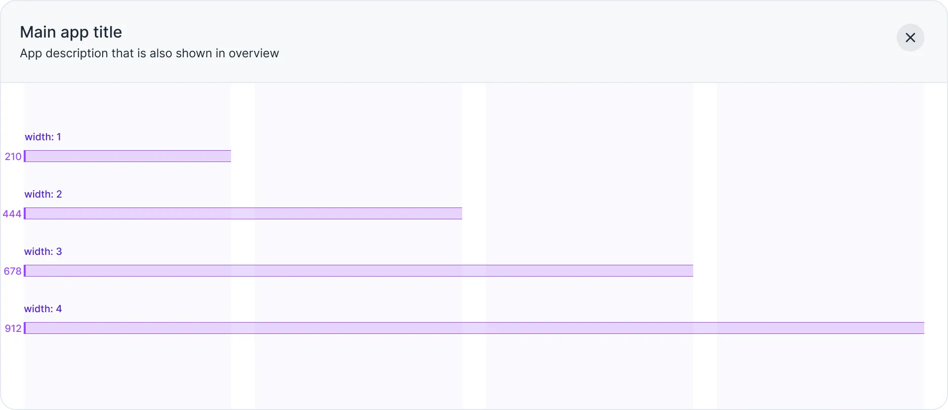
Each application developed using Buttonize adheres to a fixed four-column grid layout providing a robust foundation for creating well-structured layouts.
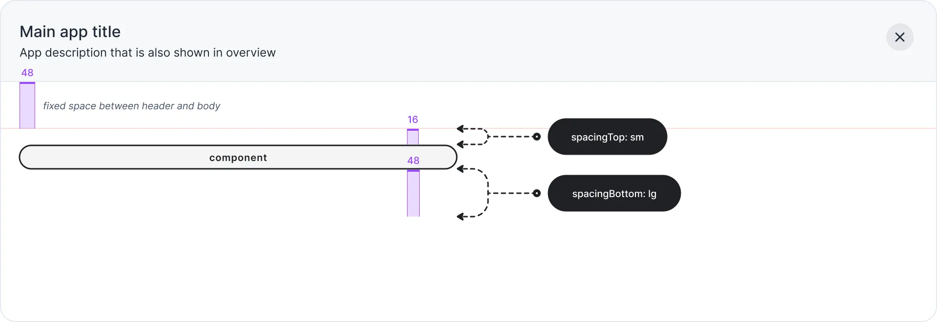
Vertical Spacing
Each component have default size that can be overriden via “width” prop. This prop is directly corresponding to the number of columns (1 -4) that the element should span within the application.
Horizontal Spacing
Each component have default setting for horizontal spacing between components. Horizontal spacing can be overriden via: spacingTop and spacingBottom props.